
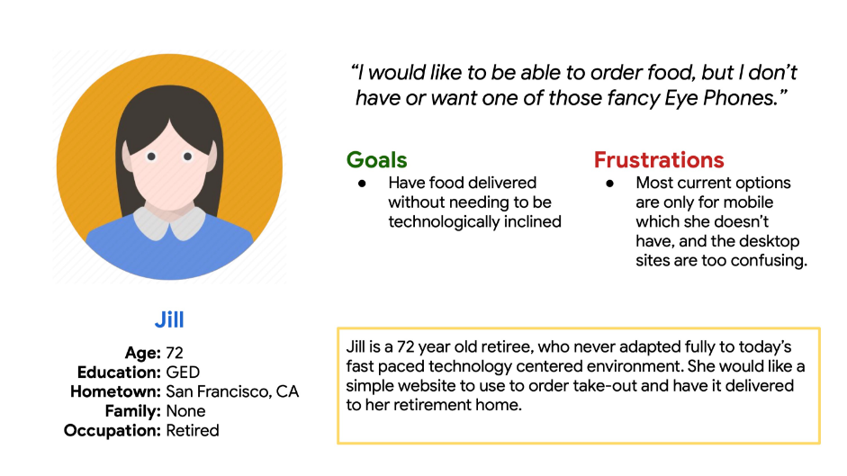
The goal:
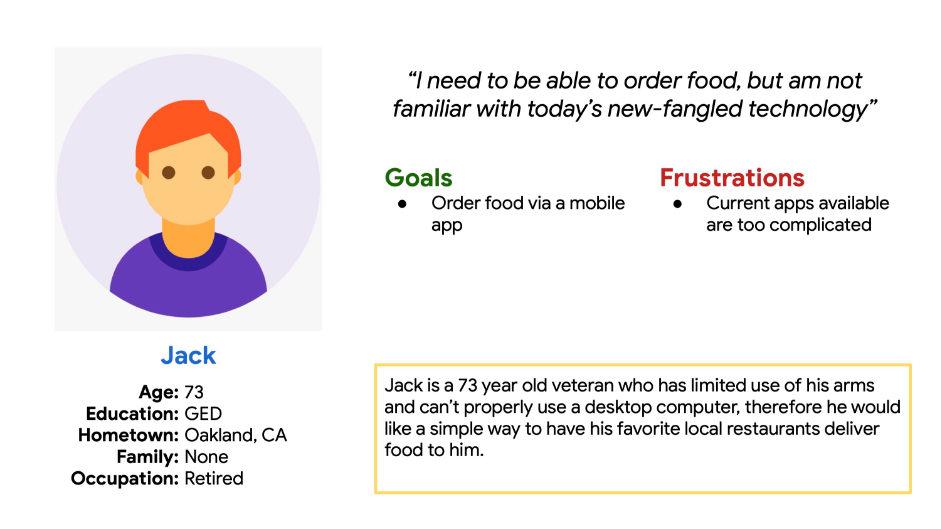
The goal of this project was to design an app for the elderly
through which they could order and have food delivered.
The plan:
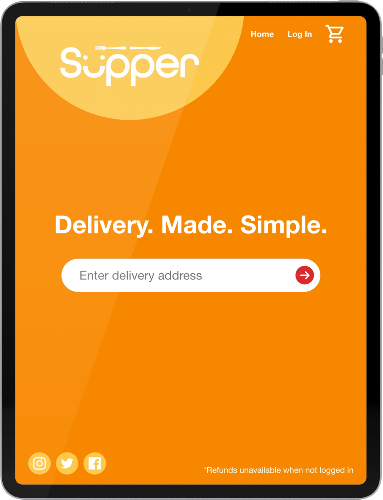
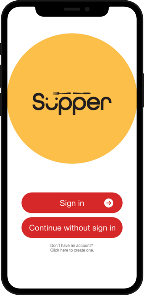
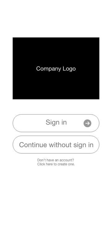
There were a few key features I wanted to implement to
make this happen. The first was to be able to order food without
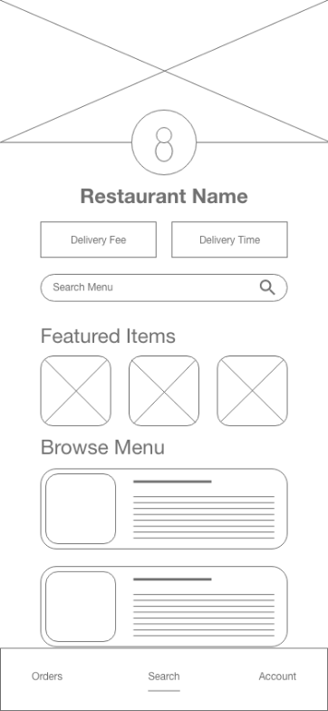
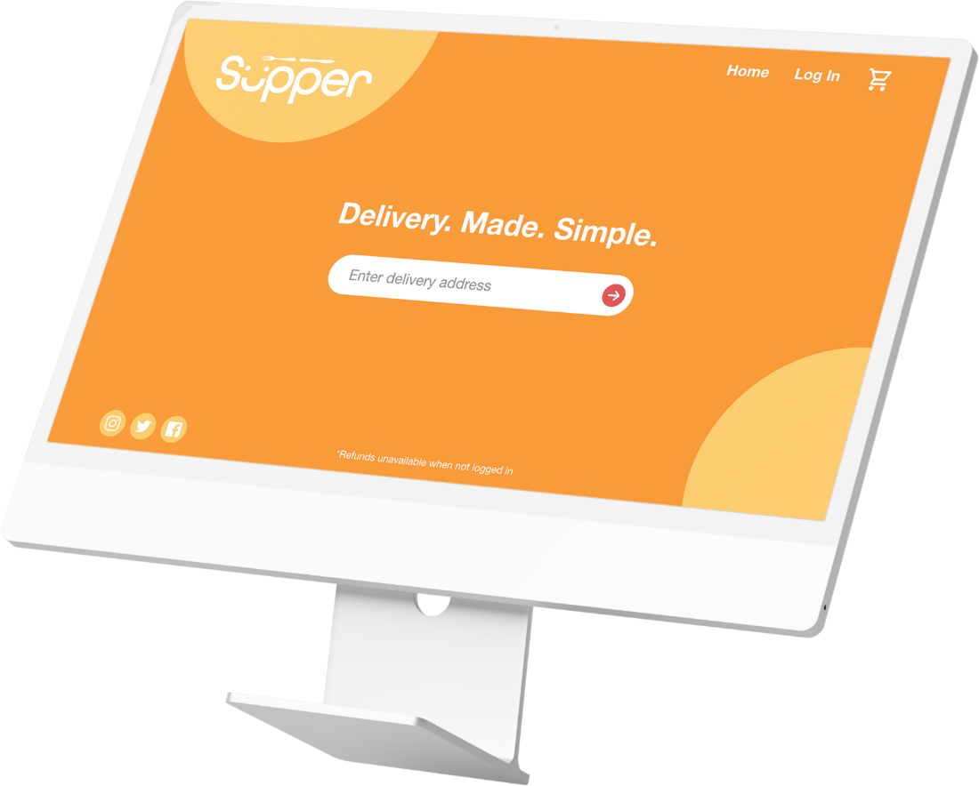
creating an account. The second was a simple and clear layout,
along with bold typography and high contrast colors.
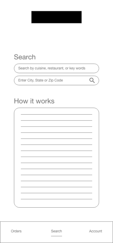
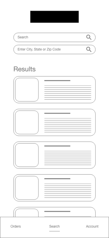

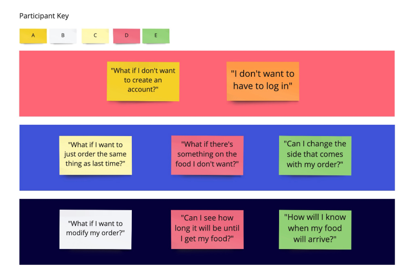
• Participants found traditional information included
on most delivery platforms such as restaurant ratings,
distance from current location, and promotional
deals were hampering user flow as they found it
confusing.
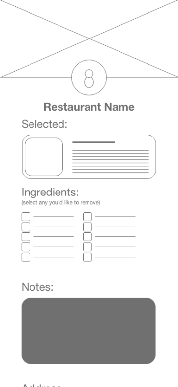
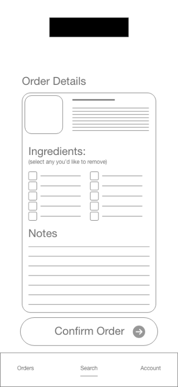
• Enabling the customers to order without creating
an account would be problematic as I would have limited
information about them.
• A lot of this information is often unnecessary and only trying to benefit the user, but seeing as how in this case it was actually detrimental, I determined the best course of action was just to remove them entirely.
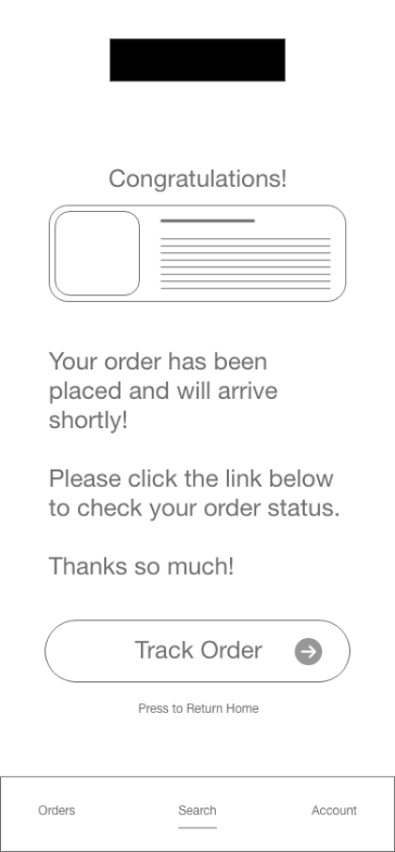
• So during my research phase I discovered that elderly users didn’t like the idea of having to “sign up” for things, as it seemed overwhelming. However I discovered it was simply the idea of having to sign up that they didn’t like, and that if I added forms to each order that would essentially collect the same information, there was no issue. This solved both problems: The users, no longer needed to create an account, and the app would have all the information it needed to complete the order. On the back end however, unregistered orders would accumulate and be very difficult to sort through should there be an issue with a particular order not assigned to an account, so I added a disclaimer that any orders placed while not logged in would unfortunately be non-refundable.
Simplicity: I found forcing myself to be as simple
as possible was extremely eye opening. Putting myself in the mindset of someone who didn’t grow up with technology the way I did was not only interesting but valuable.
User flow: This project forced me to think about
user flow in a different light. Taking a somewhat complex task and really refining it down to it’s bare essentials was an exercise that will certainly stick with me.
Breakpoints: Since this project was multi-platform and designed to be easy to use making sure it scaled properly and still felt familiar drove home
the importance of proper breakpoints.