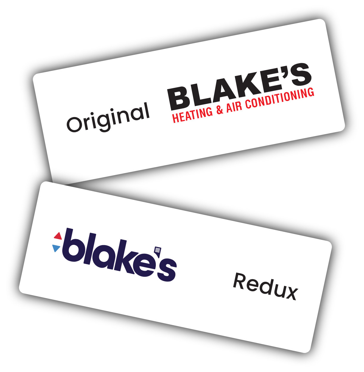
Blake’s current logo serves certain functions well in my opinion. It isn’t overly complicated, it’s very straight
forward, and is easily read when placed on the side of service vans, which is where it first caught my
attention. However, I don’t think it quite hit the mark in other aspects. While it is simple, it isn’t memorable.
Having the tagline included in order to identify what services Blake’s offers is also something that just makes
the whole logo feel dated to me.
Since Blake’s is a family owned and operated business, I wanted to use the lowercase letters to convey their
friendly nature, but create a bold and modern font that still stood out the way the original does. The up and
down arrows are something that when paired with the vent in the apostrophe, clearly convey the business
they’re in without having to spell it out. Also, while the colors help to make it pop, everything still ties together
perfectly when displayed in a single color format.