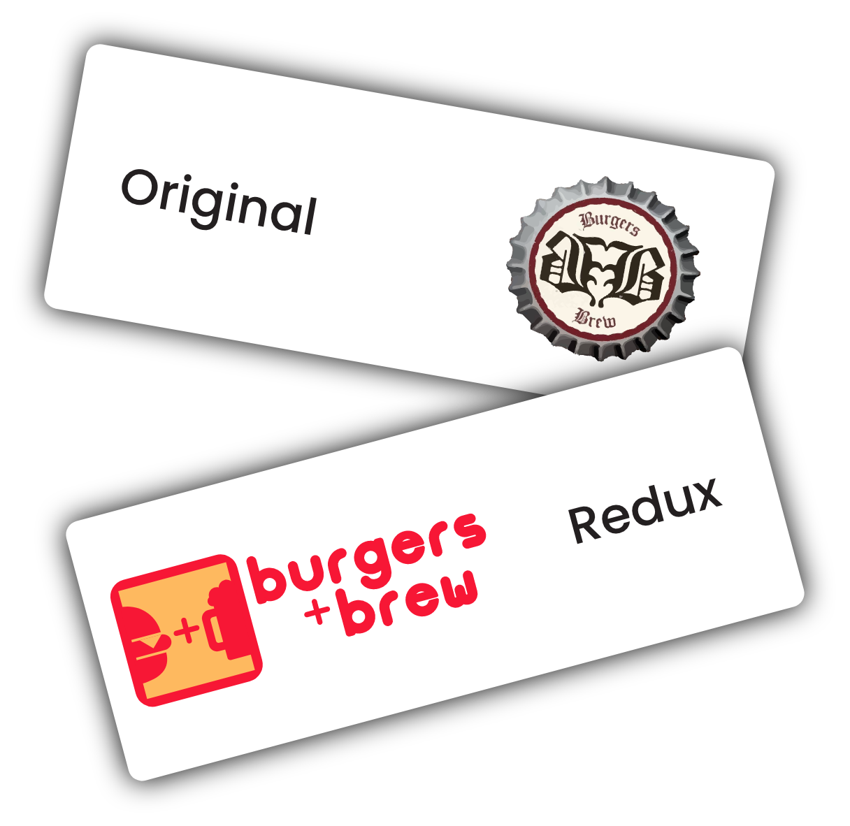
The idea behind this redesign stemmed from taking a sort of classic style mom and pop type restaurant logo and giving it a modern big box feel. The mark was designed using the golden ratios to hopefully give it a sense of familiarity. I also wanted to create something that represented the restaurant effectively without having to have the text of the name present, such as in a profile icon on social media or a food delivery service such as DoorDash.