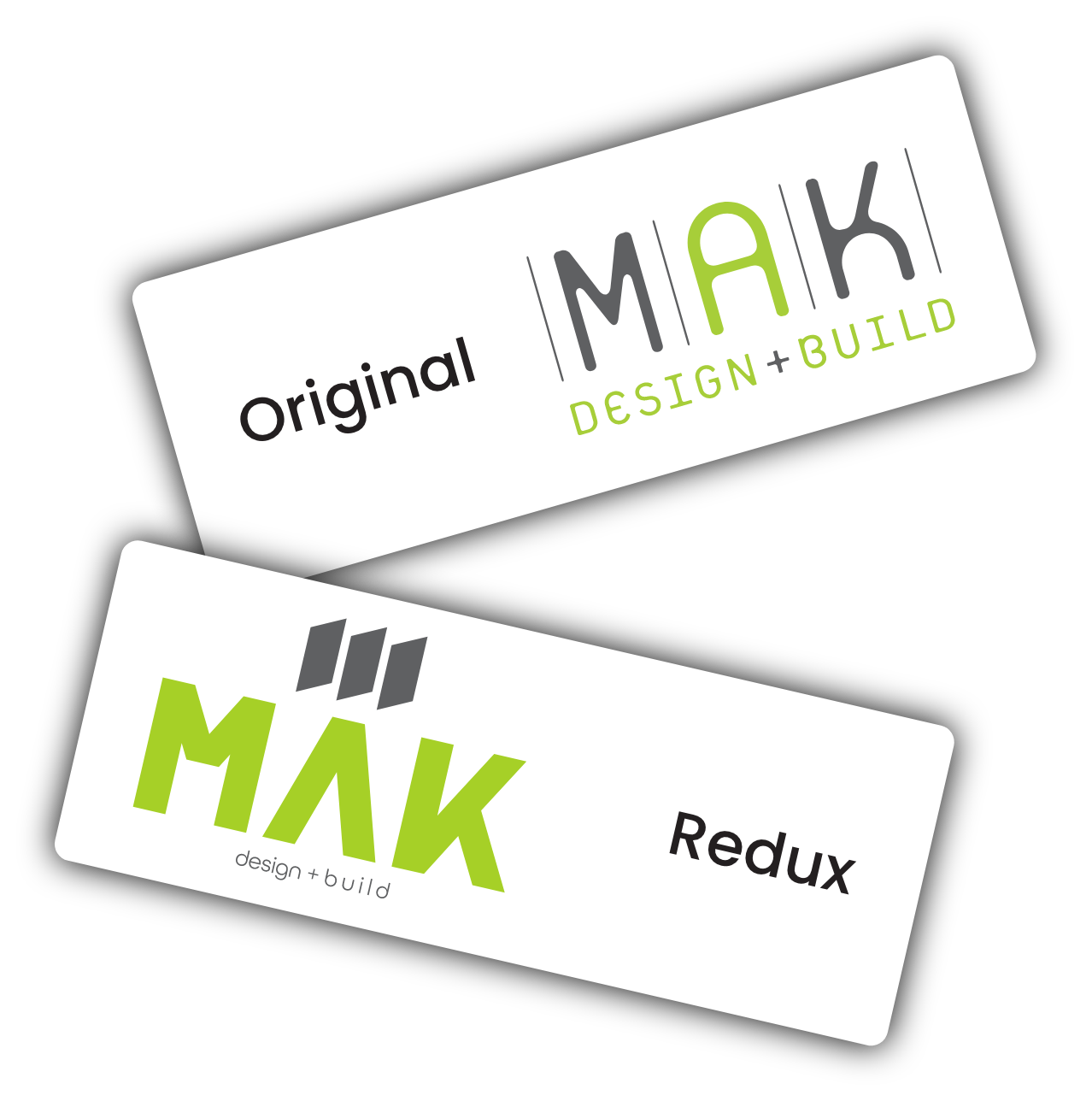
MAK is a remodeling architectural design firm who’s logo feels a bit rushed to me. Your eye is immediately drawn to the unbalanced tagline, and there isn’t any discernible message being conveyed. I wanted to create something that would represent the clean and futuristic remodels they’re known for, while keeping some of the spirit of their old logo. The division lines between each letter of their current logo stem from where their name was first displayed at their main office, an older converted craftsman style home, across 3 plate glass windows. I used those 3 plate glass windows as inspiration for a mark as seen displayed atop the MAK name. The simple flat parallelograms are interesting on their own, but with a little imagination, can also be seen as 3 rectangular plates of glass as viewed from a slight angle.
I wanted the font to be simple but defined with consistent angles so as not to draw too much attention to any one part of the name, as it is already so short. Lastly, for the tagline, I used 2 different kerning widths which allowed it to sit centered, but also provided a bit of contrast between each word, subtly denoting that the design and build processes are both unique, and implying MAK will make sure to treat them as such and accomplish them perfectly.

