
Hearken
Designing for the moments worth remembering.
Problem
A podcast guest drops a line that reframes how you think about the universe, but you're driving. It's gone by the time you park.
Mile 6 of a run, Spotify shuffle surfaces a forgotten track. The bridge hits different. However, you're not going to stop running over it, and by the time you're showered you've forgotten which track it was.
Audio moments worth revisiting, evaporating because capturing them required too much friction at exactly the wrong time.
Validation
I talked to 6 people through friends and online communities. All consumed audio during hands-busy activities. 20 minutes each, asking about listening habits and friction points.
5 of 6 had experienced this in the past month. Their workarounds were uniformly terrible:
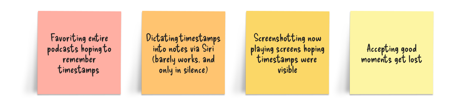
One person said they had a camera roll full of screen shots of their podcast app, even though it didn’t show the time stamp, and they never remembered why they wanted to remember it in the first place.
Solution exploration
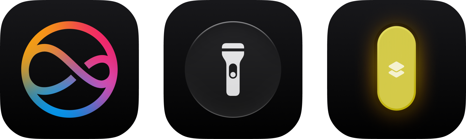
Capture had to be instant and effortless. One action, no looking, no unlocking. Considered four models:
Voice activation: Hands-free until you're on a subway or in a quiet office. This adds cognitive load and isn't practical in a lot of situations.
Homescreen widget: Low effort, wouldn't require unlocking on most phones however still requires your attention.
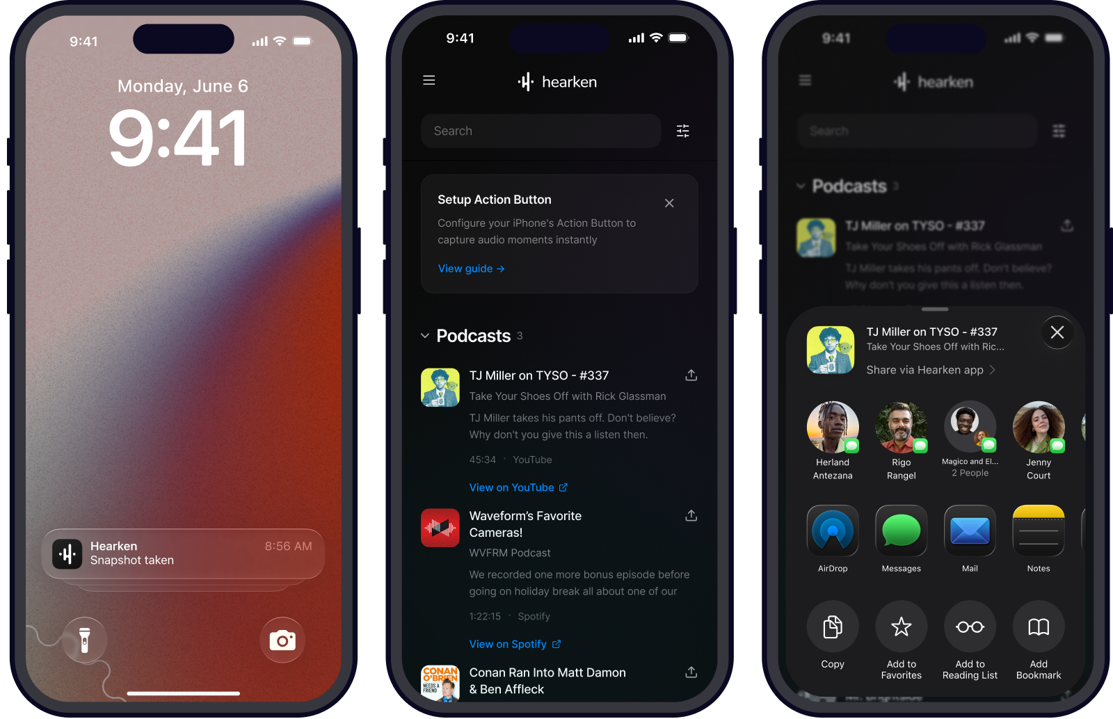
Physical button press: Action Button. One press. No screen. No voice. Works anywhere.
I chose Action Button despite device limitation (iPhone 15 Pro+, small audience now). Other options added friction or removed agency. Sometimes the right solution requires accepting a constrained audience for actually solving the problem well.
Core design challenge
Interaction solved. Press button, moment captured.
Harder: what does the app show later? How do you organize accumulated moments so they're useful weeks later, not a graveyard of forgotten bookmarks?
Two competing needs: speed and context.
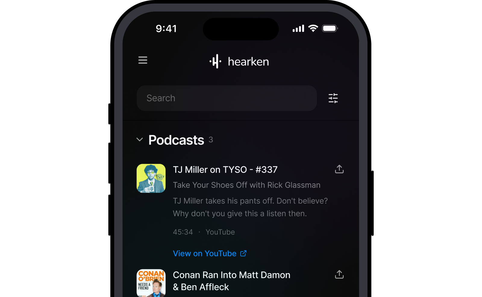
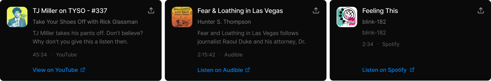
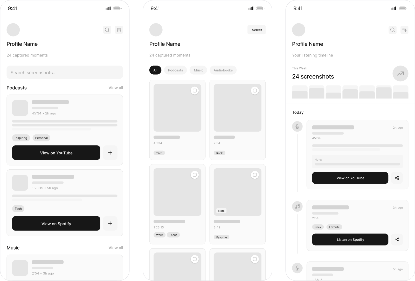
What the design does
Each snapshot gets breathing room
Visual density creates friction. I used substantial vertical space per entry, the title is prominent, source and timestamp secondary. The content types are distinctly separated, but also easily accessible.
Color stays out of way
Nearly monochrome. Blacks, whites, grays. Accent blue only for actions. Not minimalism for aesthetics but intentional hierarchy. When the only color on screen is action buttons, those elements pop. Content is the focus, and the UI disappears.
Typography does heavy lifting
Hierarchy through weight and size. Bold titles, regular metadata, small timestamps. Everything is extremely scannable.
What got cut (and why!)
Early versions had tags, notes, playlist creation. All reasonable, but all deliberately killed.
Every added feature creates decision points. "Should I tag this? Add a note?" You design friction back in.
Core value is capturing instantly and finding easily. Sharing introduces moderation and privacy problems. Playlists don't justify complexity.
Subtraction harder than addition, and usually more important.
Constraints I couldn't solve
Device limitation
Action Button only on iPhone 15 Pro+. Maybe 5% of users now. But alternative was compromising core interaction. Sometimes you design for future, not present.
Platform API dependency
Hinges on iOS media APIs staying stable. If Apple, Spotify, YouTube, Audible change data structures, app breaks. No good answer beyond hoping platforms maintain stability.
Broken links inevitable
Podcasts removed, videos go private, songs leave platforms. Snapshots save links, links die. Accepting some snapshots become metadata-only. You'll know what you saved even if you can't access it.
Local files unsupported
No streaming link to save. Real limitation for some, increasingly edge case as people shift to streaming.
Reflection
I hope to make Hearken a reality one day, but it might never exist. But that's not the point.
The point is working through real problems methodically. Identifying friction. Validating with real people. Exploring solutions, choosing based on clear criteria. Making decisions serving user needs, not aesthetics. Acknowledging tradeoffs honestly.
This thinking applies to every project. Healthcare dashboards, consumer apps, internal tools. Specifics change. Process doesn't.
Sometimes best feature is the one you don't build. Learning to subtract ruthlessly is maybe most valuable skill in product design.